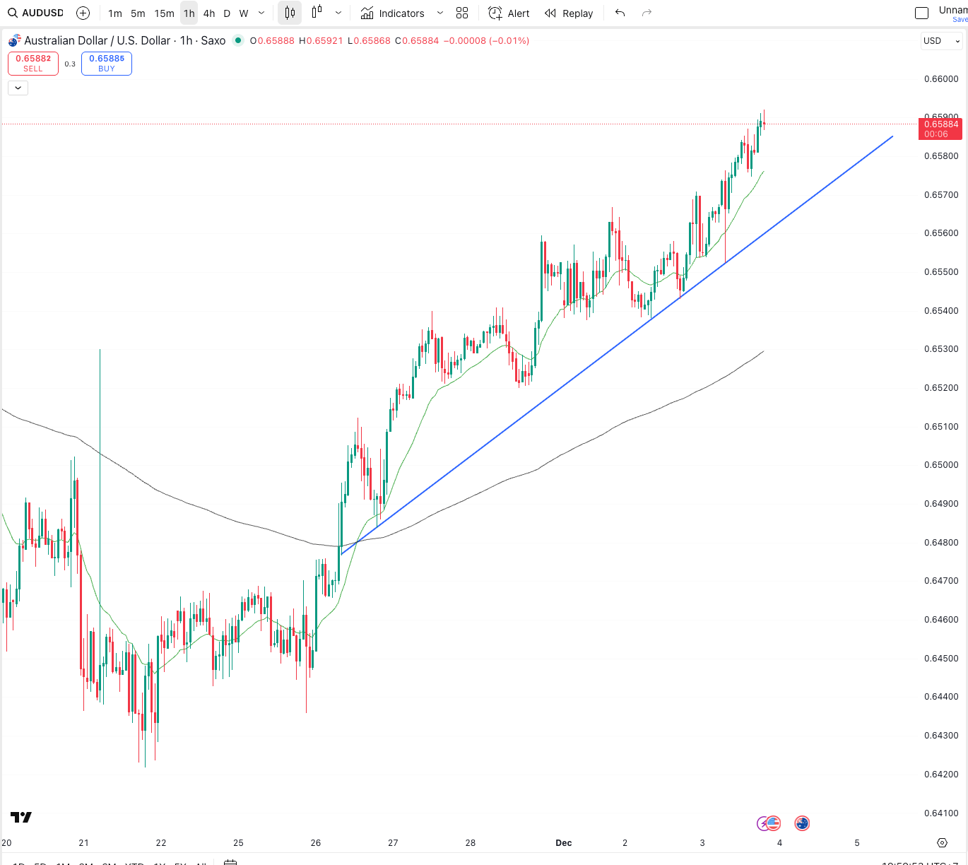
I’ve always loved how currency pairs will often follow a pattern. Not always. But more often than people think. This past week on the AUD/USD is a great example of why technical levels give your triggers.
This is an hourly chart of the Aussie. Nothing fancy. No clutter. Just price action and a simple upward trend line. And look at how well it has respected that trend over the past few sessions.
The move kicked off after the CPI print. Markets quickly priced in the idea that rate hikes might still be on the table. That shift in expectations was enough to lift the Aussie and give the market a clear direction to follow.
From there you can see how each pullback found support at the same rising trend line. Buyers stepped in almost every time. The higher lows kept stacking up. Momentum stayed consistent. And now we’re sitting at multi-week highs.
For players, agents, or anyone dealing with a USD contract, this is where a simple chart can save you serious money. These moves don’t happen in isolation. They build. They follow structure. And if you know where the levels are, you can plan around them rather than react to them.
AUD strength does not always last. USD strength does not vanish forever. But when the market is respecting a structure like this one, it gives you clarity. It gives you timing. And it gives you a chance to lock in opportunity before it disappears.
Technical levels give your triggers. The story is always in the chart.

AUD/USD - Hourly Chart
👉 Book a Currency Strategy Call
For athletes, expats, property buyers, and global professionals.
👉 Join The Currency Advantage Weekly
One email. Every Week. Market intelligence made simple.
👉 Watch chart breakdowns on YouTube
Technical levels give your triggers.
👉 Follow me on Linkedin
👉 Follow me on Instagram
👉 Follow me on X

